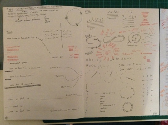
Circles have no beginning or end. They represent the eternal whole and in every culture are an archetypical form representing the sun, the earth, the moon, the universe, and other celestial objects between. Circles are used to suggest familiar objects such as wheels, balls, many kinds of fruit. They suggested well-roundedness and completeness.
Circles have free movement. They can roll. Shading and lines can enhance this sense of movement in circles. Circles are graceful and their curves are seen as feminine. They are warm, comforting and give a sense of sensuality and love. Their movement suggests energy and power. Their completeness suggests the infinite, unity, and harmony.
Circles protect, they endure, they restrict. They confine what’s within and keep things out. They offer safety and connection. Circles suggests community, integrity, and perfection.
Because they are less common in design they work well to attract attention, provide emphasis, and set things apart.

Squares and rectangles are stable. They’re familiar and trusted shapes and suggest honesty. They have right angles and represent order, mathematics, rationality, and formality. They are seen as earthbound. Rectangles are the most common geometric shape encountered. The majority of text we read is set in rectangles or squares.
Squares and rectangles suggest conformity, peacefulness, solidity, security, and equality. Their familiarity and stability, along with their commonness can seem boring. They are generally not attention getters, but can be tilted to add an unexpected twist. Think of web pages that tilts framed images to help them stand out.
Every element on a web page is defined by a rectangle according to the css box model. Web pages are rectangles made up of smaller rectangles and squares.
In Buddhist symbolism a square (earthbound) inside a circle (eternal whole) represents the relationship between the human and the divine.

Triangles can be stable when sitting on their base or unstable when not. They represent dynamic tension, action, and aggression. Triangles have energy and power and their stable/unstable dynamic can suggest either conflict or steady strength. They are balanced and can be a symbol for law, science, and religion.
Triangles can direct movement based which way they point. They can be used to suggest familiar themes like pyramids, arrows and, pennants. Spiritually they represent the religious trinity. They can suggest self-discovery and revelation.
The strength of triangles suggests masculinity. Their dynamic nature make them better suited to a growing high tech company than a stable financial institution when designing a logo. Triangles can be used to convey progression, direction, and purpose.

Spirals are expressions of creativity. They are often found in the natural growth pattern of many organisms and suggest the process of growth and evolution. Spirals convey ideas of fertility, birth, death, expansion, and transformation. They are cycles of time, life, and the seasons and are a common shape in religious and mystical symbolism.
Spirals move in either direction and represent returning to the same point on life’s journey with new levels of understanding. They represent trust during change, the release of energy and maintaining flexibility through transformation.
Clockwise spirals represent projection of an intention and counterclockwise spirals the fulfillment of an intention. Double spirals can be used to symbolize opposing forces.

Crosses symbolize spirituality and healing. They are seen as the meeting place of divine energies. The 4 points of a cross represent self, nature, wisdom, and higher power or being. Crosses suggest transition, balance, faith, unity, temperance, hope, and life.
They represent relationships and synthesis and a need for connection to something, whether that something is group, individual, self, or project related..
As with lines vertical shapes are seen as strong and horizontal shapes are seen as peaceful. Most everything said about vertical and horizontal lines can be said about vertical and horizontal shapes.
Curved shapes offer rhythm and movement, happiness, pleasure and generosity. They are seen as more feminine than sharp shapes which offer energy, violence and, anger. Sharp shapes are lively and youthful and are seen as more masculine.
From – http://www.vanseodesign.com/web-design/visual-grammar-shapes/


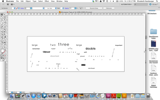
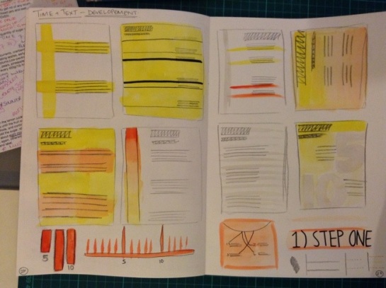
 Above are the latest mock ups I made, they still don’t really express the content very well. I need to focus on space some more and use it within my layouts… more tests, more experiments.
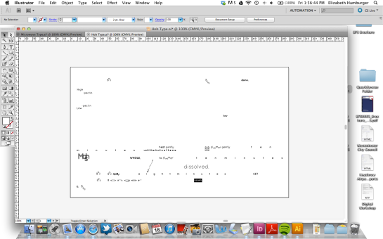