Archive

Set Brief 3 – Action(s)

It is always suggested that you do not think of the final format when creating design, however I feel like I have some good reasoning as to why I want to created a print based object. As well as this, I am trying to be less fixed on the process and allowing things to just happen. I have decided to play with the format before the content.

Firstly, I have written out my issues for and against design which I feel strongly about. However I do not feel that they have much weight when on the internet or in a digital format. I feel that if I have the words in a physical form or piece it changes my thoughts from a student rant to something substantial. By it being physical it is more permanent, not a fleeting thought. Of course the piece could be thrown away, but by it becoming physical means that my issues are not just my personal thoughts but more so a manifesto of opinions.

I have written quite a bit of text, therefore I feel like a book like format would be best. There would be far to much text for a poster, and really this book/print/publication is not really for anyone else but myself. It is a documentation of my feelings at this moment in time while studying des

20130308-165218.jpgI started drawing straight away to try and figure out what kind of layout the booklet could take. I was considering how the format could aid my message, to make it become something of value and worth.

20130308-165228.jpgFor some reason I just felt like the text would sit well within the page if centred and remaining quite small. I feel that the text and my opinions are strong so they do not really need to shout or to be bold in an attempt to seem solid. From drawing, I felt that the way the type was set, not to be as important as the actual artefact. I feel like this piece is an object of opinions, a piece of myself. Type is important but like said before, it doesn’t need to shout for attention.

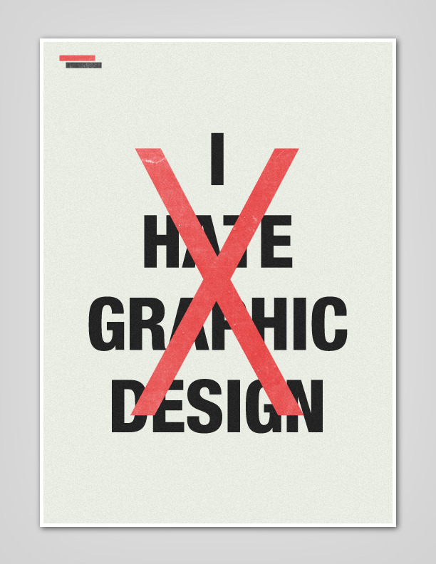
This project is quite hard in the sense that I am trying to represent to different ends of one spectrum. Showing how the emotions of love and hate are the same – but different.

20130308-165240.jpg 20130308-165252.jpg I feel that my definition expresses well my issues with studying graphic design. It also feels like the mid-point between the two ends of the spectrum. The understanding of my own behaviour of emotions.

20130308-165303.jpg

I kept playing with paper and how this book could work, some were successful, some were not.

20130308-165309.jpg

I stepped away from the idea of books a bit as a book is an object that contains text/images in an order that communicates a narrative. My writing does not have a narrative. They are separate points that could be read together or in any order. I started breaking up the pages to see what this communicates.

Still struggling with the idea of a book as well as separate sheets I decided to look at different ways of folding paper. I didn’t necessarily want to create a poster as this piece of writing isn’t really for anyone, but it also wasn’t a book. I combined the two so that the piece initially looks like a booklet, but once opened it can display all the information. I will push this piece further, I still need to experiment some more with formats – what else is there other than print?

20130308-165402.jpg20130308-165349.jpg 20130308-171040.jpg

“Hate is often considered to be an evil passion that should, in a better world, be tamed, controlled and eradicated. Yet to the biologist, hate is a passion that is of equal interest to love,” Professor Zeki said.

The Independent  – HERE

manifesto is a published verbal declaration of the intentions, motives, or views of the issuer, be it an individual, group, political party or government.[1][2][3] A manifesto usually accepts a previously published opinion or public consensus and/or promotes a new idea with prescriptive notions for carrying out changes the author believes should be made. It often is political or artistic in nature, but may present an individual’s life stance. Manifestos relating to religious belief are generally referred to as creeds.

Wikipedia Manifesto – HERE

I feel like my piece of writing is similar to a manifesto as it is an expression of my opinion even if it is on an extreme scale of love and hate.

Design Bipolar
de·sign bi·po·lar
Attributive Noun; Disorder that is characterised by extreme episodes of Hate/Love towards design.

Today was going well with my change of direction, I thought I knew what I was doing with some degree of confidence. However somehow throughout the day this disappeared and I was in complete disappear about what I was doing for the project, as well as on the course.

I think I go through this stage within every project. I become immobilised with self doubt, flitting between ideas, concepts, thoughts reasons. Then in the end it’s a week later or so and I have no work just worries and everyone telling me to get on with it and bloody make something!

Today the peak of all my WTF IS THE POINT episodes. Angry, I decided that I am going to forget everything I have done for this project so far and just make something that expresses how F**KED off I am with doing design. After going through quite the therapeutic session of writing out my annoyances, I had a discussion about one of the points and saw that actually, the negative also has a positive side, even though I may not see it now. I went through the same words that I used before and tried to find the positive aspects of them. And to be honest once I started writing about them I can see that it is a clear love hate relationship, I just tend to go over board – hence the design bipolar.

So I am just doing this simple task of visualising/designing with the content I have written. Not over complicated just simply creating a design that is responsive to content.

1. Judgement

The judgement of your work is never a personal critique, it is about helping you become more knowledgeable about design as a practice. Subjectivity within graphic design means that there is a discussion between you and your peers. Having a perspective allows you to form a set of opinions and eventually go on to understand why you in believe them. By discussing work in a critical and analytical way, it forces you to be engaged with the subject as well as aiding you in becoming better at communicating ideas and thoughts.

2. Reasoning

Art Is Interpreted. Design Is Understood. 
There has been a long debate as towards the difference between Graphic Design and Art. Art is created to satisfy the artists needs. Design is to communicate an intention, aim or purpose for it to be design. When discussing design work there is nothing more satisfying than when you are asked “Why did you do that” and you are able to respond with a solid reason. Conscious design decisions are what set apart those from general designers. Originality comes from reason. Confident decisions with justification means that the visual outcome of any design project should connect fluidly with the concept.

3. Forced Creativity

If you are not pushing the boundaries, then you are most likely not pushing yourself to the full potential. Being told what to do is never a pleasant thing, but it is being said with good intention. Creativity is about doing things that you would not normally do. It is about taking risks and seeing what happens. University is the perfect place to make these Happy Accidents, there are no financial commitments, no clients with high expectations. Happy Accidents are the equivalent to the light bulb moment. But are more likely to have a Happy Accident from experimenting and doing things outside your comfort zone than an amazing idea popping into your head. Doing and not thinking allows creativity to self generate.

4. Self Initiated Projects

Graphic Design is changing. Designers are no longer people sitting at their mac visualising other peoples thoughts, opinions and ideas. Designers are people have their own voice, interests and outlook. Self initiated projects are a great opportunity to refine your communication skills. It also allows you to consider what kind of designer you are, how your design values connect with your day to day life and via versa. Self initiated projects are a chance to do what you enjoy before graduating. Once in the real world the opportunities to create your own work because you want to become smaller.

5. Resentment

After all the judging, reasoning, forced creativity through self initiated projects comes a long the feeling of resentment. But this is not really resentment. It is an experience that comes from over thinking and pushing yourself creatively as well as conceptually. Design is going to be annoying, frustrating, disappointing etc. Feeling this way towards design means that you are really questioning your practice and opinions. By understanding what you are resenting will enable you to counteract the issues. Pushing passed the feelings of resentment will eventually lead to gratification.

1. Judgement

Creative subjects are subjective. Therefore the idea that design can be graded is wrong. What I think constitutes as good design will most likely differ from someone else’s opinion. Having a marking system in graphic design is accurate. If someones work does not fit into a generic category it does not mean it is wrong or not of worth. This judgement system leads onto self doubt and questioning, therefore lack of confidence which hinders creativity and enjoyment.

2. Reasoning

From the first year you are brainwashed with the idea that content is king, and that every project must have a solid concept for it to be deemed successful. This concern with meaning and concept is utterly draining. It is mentally draining when you end up spending a week of your project trying to understand, consider and define what you are doing, why and what is the value of it. Focusing on content and concept will sooner or later prevent you from creating anything. This point links heavily with Judgement. Some times it would be great if “Because I want to” was a good enough reason to be able to do something. The brainwashing of concept is ultimately crippling.

3. Forced Creativity

Within a design degree  you are expected to push the boundaries. This is fair enough if this is the individuals intent, however if it is not then you creating a level of expectation which is effectively a judgement system. Telling someone to be creative or experimental causes them to question their process. This means that the person will decide to be creative, however what this really causes, is the idea to conform to someone else’s idea of what is creative. It’s a known that you tend to get ideas at the most unlikely times, this is because you are not pressuring yourself to think. Trying to be creative constantly is not the right mindset.

4. Self Initiated Projects

In the last year of study there is a big emphasis on you as a designer being also an author. For some students this idea of creating whatever they wish is great, until all the elements of Judgement and Reasoning filter in after the initial excitement of freedom. The reasoning plays a huge part within these projects. Being an author of a project means that the projects are 100% you. Nothing to do with your tutors, or any lecturers, its all you. Therefore there is a lot of pressure surrounding this projects, as they tell a lot about an individual. Even though these projects are quite different from those set by tutors, you are still contained within a marking system. Hence the project will be deemed of value if it ticks the right generic boxes.

5. Resentment

After all the judging, reasoning, forced creativity through self initiated projects comes a long the feeling of resentment. What seemed exciting in the first few weeks of first year eventually changes and it becomes increasingly hard to understand why you chose the subject in the first place. By being over analytical of something eventually drains the interest and enjoyment from the subject.

This is the first project I have ever had to change the direct of… This project is still about the CSM building but not about the signal.

Brief

I am someone who either has a lot to say or nothing at all. I am also responsive rather than a pure creator. This behaviour is clear via my twitter account. I respond to things I see, hear or experience…like everyone else, but I do so in quite a honest way. No going round the houses.

Taking inspiration from my many honest messages, I plan to respond to the CSM building. As this is an area I spend a lot of time but do not necessarily respond to. I also feel that it would be interesting to comment within the environment as then the context is maintained — unlike when I tweet, I am changing the context of the situation and the statement. Also when using twitter you are restricted to a 140 character limit meaning that important reasoning can be missed.

(The message is the Action: This will involve the act of responding to an environment.)

This project will be focused on the audience within the CSM building, I intend for people to engage with this statements. Whether by reading or even responding to my statements.

I intend to act upon my priorities as an information designer by creating a system to clearly show my responses.

Next…
– Research : responding to environments
– Places : find the locations or things I want to comment upon
– Write : consider and express my reasons why I feel that way
– Experiment : create evolving interventions

START MAKING!

20130304-151419.jpg

Today has consisted of research. I’ve looked at information design, way finding and mapping in general. After understanding what a map is, I don’t feel that a map is really the right platform for my subject.

When thinking about the functionality of this project, I don’t think it necessary for a user know where all the locations are at one time. For example, if you were in studio k, or even floor 2, you would not really be concerned with where the signal points were on level 3.

I am leaning towards an installation or highlighting of an area. I am sure there will need to be some kind of way finding, as if the specific signal area is not in your view point you will need to look for it.
As well as this I am also considering how a physical system could be created so that a person is able to document or show their own signal hot spot, they could include information like carrier, network etc. How strong the signal was etc.

20130304-151245.jpg

20130304-151303.jpg

20130304-151328.jpg

20130304-151343.jpg

I went around the second floor to see if there were any marks that tried to emphasise a space, there wasn’t really many spaces that were defined by marks. Therefore I decided to move on and look at collecting data. And this act made me realise that you can not assume data.

While tried to record where signal was strongest, I found that on all bridges, it was pretty much the same. If you are in a space that isn’t the studio, you will get signal. This means that the building is just divided into two spaces, signal / non signal. Basically inside / outside, and it is only outside where you will get signal.

20130304-173122.jpg

20130304-173139.jpg20130304-173131.jpg

So now I feel stuck with my project. It seems have been simplified so much that surely it is common sense that if there is no signal in the studio then then will go outside of the studio? Perhaps I can make something that is merely a commentary on the fact signal is not accessible everywhere, rather than creating a functional system to help people. Something to prompt people into recognising that one area is more usable than another…

Brief

My message is to the society within CSM. I wish to inform the students and staff of the locations where mobile phone signal is strongest.

I intend to act upon my priorities as an information designer by creating a system to aid and inform the community so that they are able to send their own messages.

Within this project I have restricted myself to only a section of the building due to the time scale of this project. This section will be floor 2 excluding the all studio spaces other than F & K.

In this project I will consider how people engage with mapping ( creating and using ) systems as well as information design as a whole.

Wikipedia Mobile Phone Signal

mobile phone signal (or reception) is the signal strength (measured in dBm) of the connection to the mobile phone with its network. Depending on various factors, such as proximity to a tower, obstructions such as buildings or trees, etc., the signal may vary. Most mobile devices use a set of bars of varying heights to display the strength of the signal where the device is located. Traditionally five bars are used; see five by five.

Dead zones

Areas where cell phones cannot transmit to a nearby cell sitebase station, or repeater are known as dead zones. In these areas, the cell phone is said to be in a state of outage. Dead zones are usually areas where cell phone service is not available because the signal between the handset and cell site antennas is blocked, usually by hilly terrain, excessive foliage, or physical distance.

A number of factors can create dead zones which may exist even in locations in which a wireless carrier offers coverage, due to limitations in cellular network architecture (the locations of antennas), limited network density, interference with other cell sites, and topography. Since cell phones rely on radio waves, and radio waves travel though the air and are easily attenuated, cell phones may be unreliable at times. Like other radio transmissions, cell phone calls can be interrupted by large buildings, terrain, trees, or other objects between the phone and the nearest base station antennas.

Many wireless service providers work continually to improve and upgrade their networks in order to minimize dropped calls, access failures, and dead zones (which they call “coverage holes” or “no-service areas”).

Arbitrary Strength Unit (ASU) is an integer value proportional to the received signal strength measured by the mobile phone.

It is possible to calculate the real signal strength measured in dBm (and thereby power in Watts) by a formula. However, there are different formulas for 2G and 3G networks.

In GSM networks, ASU is equal to the RSSI (received signal strength indicator, see TS 27.007 sub clause 8.5).

dBm = 2 × ASU – 113, ASU in the range of 0..31 and 99 (for not known or not detectable)

In UMTS networks, ASU is equal the RSCP level (received signal code power, see TS 27.007 sub clause 8.69 and TS 27.133 sub clause 9.1.1.3)

dBm = ASU – 116, ASU in the range of -5..91 and 255 (for not known or not detectable)

It is widely disbelieved[by whom?] that ASU = “Active Set update”. The Active Set Update is a signalling message used in handover procedures of UMTS and CDMA mobile telephony standards. On Androidphones, the acronym ASU has nothing to do with Active Set Update. It has not been declared precisely by Google developers.[1]

Mapping Mobile Phone Signal

Coverage Map. User enters details to receive specific information regarding their mobile phone carrier. Read full article HERE

Another website that shows mobile phone signal, it also does exactly what I suggested earlier, it allows users to add different networks and additional information. Seems to be an American only site – HERE

BBC Website – Data 3G & 2G Coverage HERE

Screen Shot 2013-03-03 at 15.16.34

About the data

The data displayed on the map was collected by people who chose to participate in our survey by downloading the app to their phone. The data only provides a snapshot of the mobile coverage experienced by this self-selecting group over a short period. The BBC has not attempted to balance the participants either geographically or by service provider.

Each box on the map indicates the average reception within that area over the survey period. Areas showing no coverage could be the result of a single phone losing signal. The map does not take into account factors such as reduced reception while in buildings. The map is not intended to replace the service providers’ own coverage maps when making a decision about taking out a mobile phone contract.

In terms of my map and data I will need to decided how I will decided what is high or low signal strength. Do I want to show places that are only full signal spots? Or do I also want to show locations that have weak or medium signal? Is that necessary information to know. I think personally I would only care about full signal spots, but I do know some people love to wonder while on the phone, perhaps knowing where the signal will get weak will stop them wondering off to far so that their call drops.

This also brings up another issue, how will I divide up the space? By square meters? Or general sections such as stairs, door ways etc. There are a lot of questions, which I need to think of, as it would not be helpful for these questions to arise while half way through my project. I think I will need to find out from other students what they would need from this map.


New UAL Campus for Central Saint Martins at King’s Cross

Status: 2011
Location: London

Client: University of the Arts London / Argent
Value: £145.0m

By Stanton Williams – Visit webpage HERE

The design combines the 19th century Grade II listed Granary building and transit sheds – with a 200 metre long new building that uses industrial materials and creates robust spaces for the students, full of natural light. An internal street draws daylight in and acts as a central circulation spine with suspended walkways, cafes, film, graphic and light projections. The spaces are designed to be flexible and ‘raw’, to allow the different departments within the college to develop their own identities, whilst maintaining the integrity of the buildings as a whole.

As a student here I think the building is fantastic, it is open, bright, and new. Many people feel that the building is too clean, but its like having a new mobile phone, you don’t want to get it scratched in the first week, you want to admire its newness! Eventually it will become more like an art school, but it shouldn’t be forced, people shouldn’t draw on the walls for the sake of it.

Even though this is an amazing building, its down fall surrounds the issues of mobile phone networks. Within the building it is pretty difficult to get a signal, when in a studio space you have no hope. These problems have occurred due to the mass of concrete and metal used within the building.

The floor plan is obviously a different kind of map to one that is used by visitors. They both map out an area but have different purposes. However by looking at this plan, I can’t really tell which part if the university it is displaying. It must be the street rather than floor 1+. However each studio is also different.

photo-3This is the map I found within the student guide, it gives a general sense of the building. Similar to the floor plan, but gives more detail to where specific rooms are as well as extra information such as toilets and stairwells.

This is a floor plan created for last years degree show. This one again has information that shows everything position in relation to everything else.

By looking at the already existing information, I do not think it will be possible for me to collect the phone signal data within the whole building within a single week, as well as for multiple phone companies. The building has around 10 acres of floor space, therefore recording all this data would be impossible for the size of the space. Perhaps I could then create a system that would be editable by the user, they could add points or locations within the building where signal is strong, as well as what mobile provider they are with.

For now, I think I will stick with the space that is Level two, maybe just studio K & F as I do not think that is open access, so it unlikely I can go in there let alone document mobile phone strength. This is actually another issue with the building your student cards do no always let you access all the spaces. This means there could be a problem, if I see on the map an area that states there is a strong phone signal, but an able to access that area, then it is no good. Perhaps it is a good idea to consider making people aware what spaces are open and freely available as well as which spaces are private studio or require card entry.